ShopDreamUp AI ArtDreamUp
Deviation Actions
Description
Yes,it is my 1500th deviation..maybe until I clean up my freakin' gallery and there's a LOT to clean up. Oh boy..
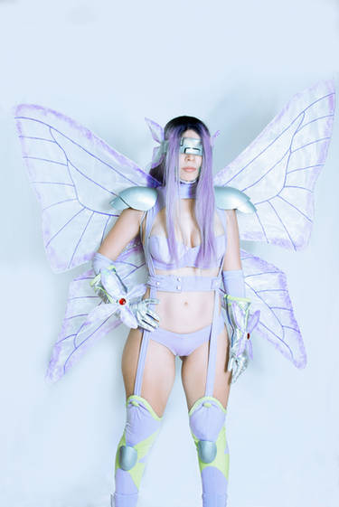
So here's this idea of Iczer 2 being sent into a cyberpunk future of the Earth like 2035 or something whilst riding on neon motorcycles and having badass chase scenes involving a LOT of firepower...now that is what you call awesome and it would define the term Iczer in a matter of seconds. What am I talking about? Well,the answer will be coming soon in the form of an explanation...be sure to stay tuuuuned.
So here's this idea of Iczer 2 being sent into a cyberpunk future of the Earth like 2035 or something whilst riding on neon motorcycles and having badass chase scenes involving a LOT of firepower...now that is what you call awesome and it would define the term Iczer in a matter of seconds. What am I talking about? Well,the answer will be coming soon in the form of an explanation...be sure to stay tuuuuned.
Image size
1635x2325px 622.69 KB
© 2015 - 2024 RyugaSSJ3
Comments11
Join the community to add your comment. Already a deviant? Log In
This is a really awesome piece! it's very dynamic and full of motion, and the background and figure both look pretty good. I agree with some of the other comments, though, she does blend with the background a little. there are a lot of colors that are all in a mid-value range, without a lot of lights or darks. part of this comes from using markers, it can be very tough to get a value range out of them. but leaving a few highlights next to dark shadows on the figure and using lighter colors for the background would've help her stand out a bit more.
one thing you could do is consider the shape of the object you're coloring, which areas are in shadow and which are in light, and try to go quick with less pressure in the light areas, and a little slower with more pressure in areas of shadow, particularly when shading round objects. It takes a while to get the hang of doing it by hand, but it can really add a lot to the coloring when you have just a little bit of shading while you're going, rather than blocking in a whole area in a solid color without thinking about the form underneath.
The only other thing that jumps out at me is, compositionally, there is a lot of empty, dead space above her head and my eye keeps getting drawn there, particularly with all the bright yellows being around that area. with her appearing to rise up, it might've been more effective if she were closer to the top of the frame with the empty space below her, sort of left in the dust, putting her at the peak of her movement instead of falling away from it.
ProjectComment


![[Fighter girl - Street Fighter]](https://images-wixmp-ed30a86b8c4ca887773594c2.wixmp.com/f/56f45a1a-aac8-479b-843d-f751d5224731/dc8l23j-f824ce2a-396c-44ed-a01b-1fc1086a8768.jpg/v1/crop/w_184)

